Heirloom is a product system consisting of a kitchen utensil, thermal imaging camera and an app. It allows students to recreate their family recipes, just like mama makes. It encourages the maintenance of family and cultural connections, mitigating those feelings of homesickness. Heirloom brings home to the kitchen.

Personas
Alex Chen
19 Years Old
International Student at University of Derby

Ah Lam Chen
49 Years Old
Mother of two
Lives in Singapore

At their core, personas are about creating products with a specific user in mind. A deep understanding of my target audience was fundamental to creating Heirloom. My personas helped to create understanding and empathy with my end-users: the international student and their family abroad.
“Personas consolidate archetypical descriptions of user behaviour patterns into representative profiles, to humanise design focus, test scenarios, and aid design communication” (Cooper, A. (2004)
Stakeholders
Stakeholders are people who have the power either to affect or be affected by the design project.
The stakeholder map was a good visual to identify who I was trying to satisfy when designing Heirloom.


Brand experience map
The journey map helped me understand how customers interact with and feel about the brand: every point they engage with the brand and their impressions of each interaction – especially those that occur before they decide to make a purchase.

Brand personality

It was especially important to set the tone for my brand. After understanding my users’ needs and wants, defining a brand that resonates with them was crucial in creating a product that they would want to buy. Personality traits such as comforting and reliable can help build customer confidence.
Colour palette


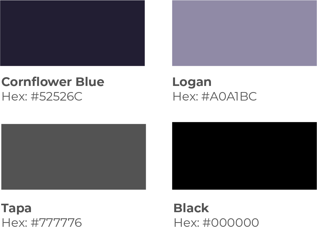
The colour palette was defined from the brand personality guidelines. As my user group varies in ages and genders, and will be used in multiple types of kitchens, a relatively neutral palette was required. The shades of purple and grey evoke feelings of calm and family, according to colour philosophy. Black accents create contrast, making specific features stand out.
The two colourways reflect the relationship between parent and child.
The product system
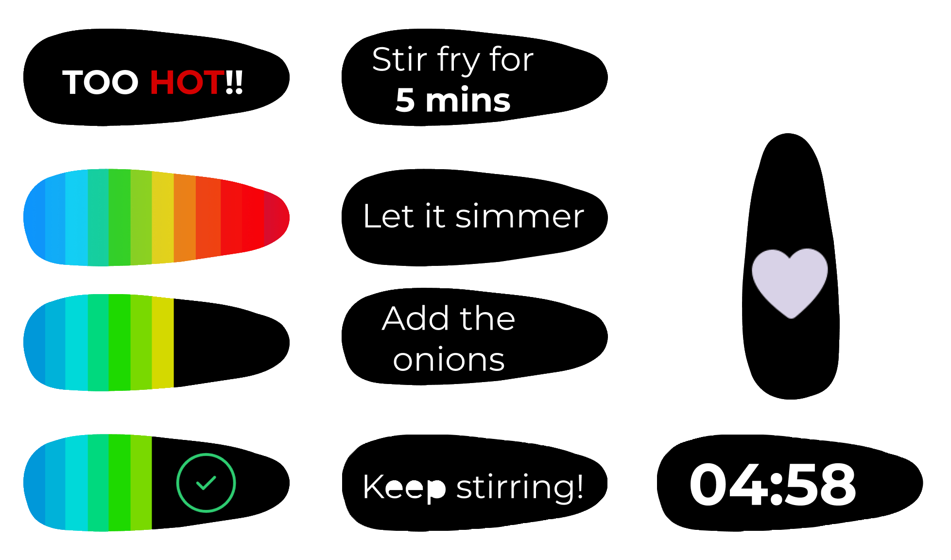
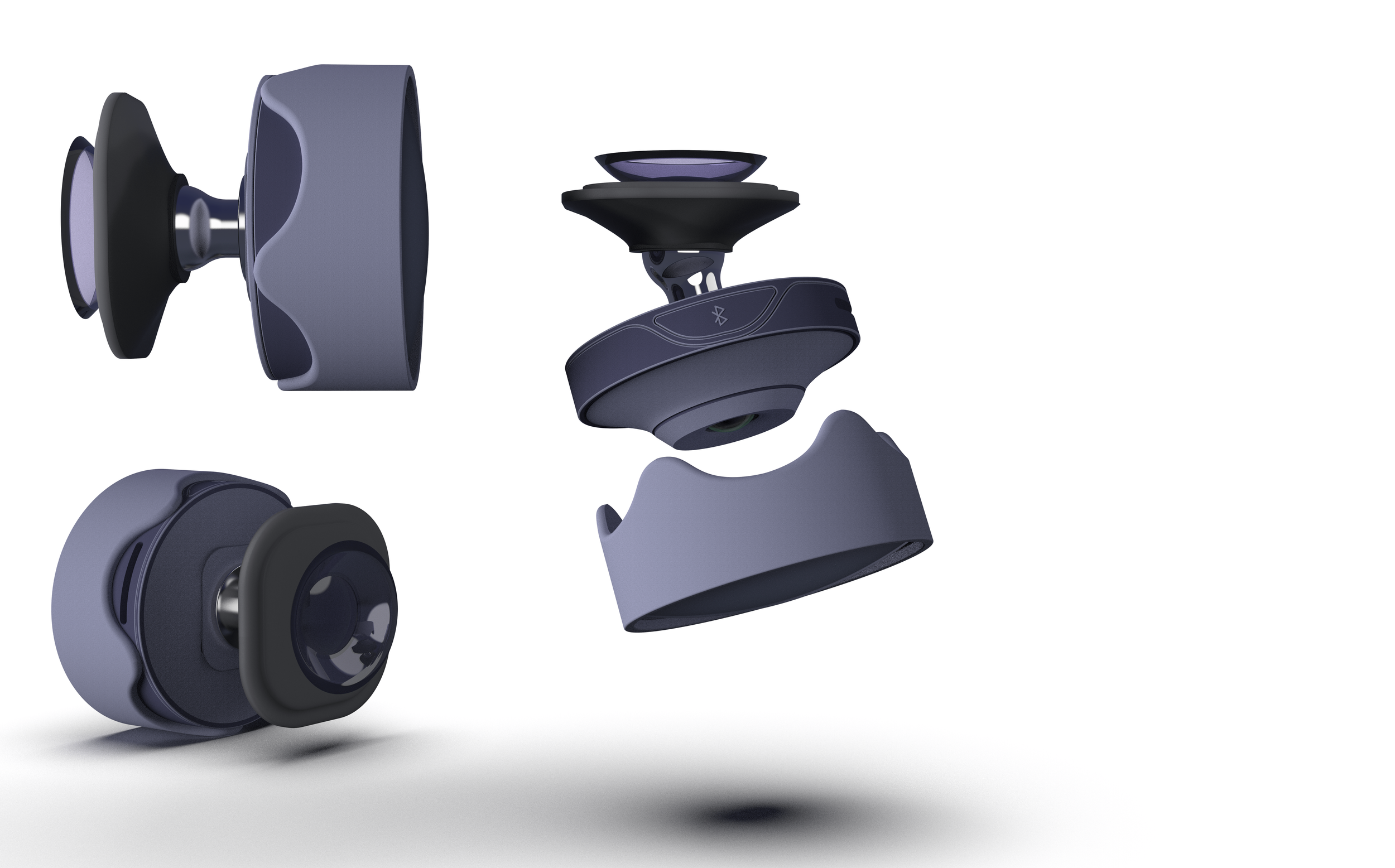
Designing a cohesive product system creates a recognizable brand identity. Product colours, contours, and materials are harmonious. The app colour scheme and typefaces adhere to the brand guidelines. Materials are soft touch, and there are no harsh edges / corners, which represents the brand personality.
The UX
Wire-framing

The student journey

The parent journey
Mid-fidelity prototype

Setup
Parent
Student

High-fidelity prototype
Interface UX


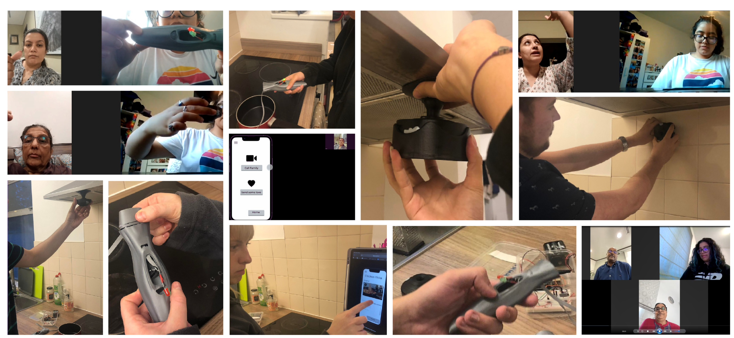
Prototyping + User testing


Key changes from user testing
A “share to feed” option on the app. This can be within the family or to the wider community.
LED combinations for connecting to the bluetooth and turning the product on. This must be indicated on the screen too.
Suction cup option on camera to attach to wall safely and damage free.
Low charge indication + voice confirmation of connections
Design for manufacture


